# 2.两栏、三栏布局(圣杯布局、双飞翼布局)
# 两栏布局
# 一栏固定宽度,一栏自适应
# 一、左 float,右 margin-left
<div class="left">left</div>
<div class="right">right</div>
body,
div {
  padding: 0;
  margin: 0;
}
.left,
.right {
  height: 200px;
}
.left {
  float: left;
  width: 200px;
  background-color: skyblue;
}
.right {
  margin-left: 200px;
  background-color: greenyellow;
}
因为块级元素有流体特性,即默认会填充满外部容器,所以只需要设置 margin,不需要设置 width 就可以让 content 填满剩余的部分。 这里 margin-left 的宽度和左栏宽度一样,是因为左栏浮动,脱离文档流。
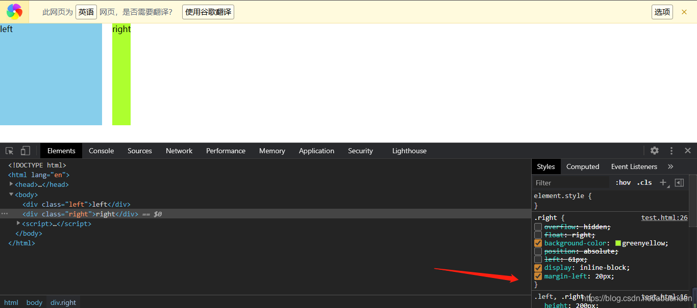
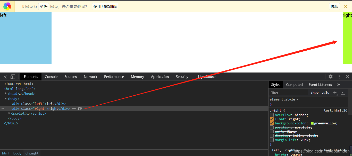
# 二、左侧 float:left; 右侧 overflow:hidden;
<div class="left">left</div>
<div class="right">right</div>
body,
div {
  padding: 0;
  margin: 0;
}
.left,
.right {
  height: 200px;
}
.left {
  float: left;
  width: 200px;
  background-color: skyblue;
}
.right {
  overflow: hidden;
  background-color: greenyellow;
}
核心思想是触发
BFC。 回顾一下 BFC 的四种情况: 1、float的值不是 none。(right、left、inherit) 2、position的值不是 static 或者 relative。(absolute、fixed、 sticky) 3、display的值是inline-block、table-cell、flex、table-caption 或者 inline-flex 4、overflow的值不是 visible(hidden、scroll、auto) 注意:这里左 float,右只能是 overflow 才能实现两栏布局
触发了 BFC 的元素仍然保持
流体特性,也就是说 BFC 元素虽然不与浮动交集,自动退避浮动元素宽度的距离,但本身作为普通元素的流体特性依然存在,反映在布局上就是自动填满除去浮动内容以外的剩余空间。
1、position:absolute 时
- 这里加一个 margin-left 便于区分。
- 绝对定位会叠加在 float 元素上面,并且不会自动填充
- position 不设置宽度时,根据内容确定宽度
- 有一种办法可以解决:给右栏添加
left:200px; right:0;在方法三有讲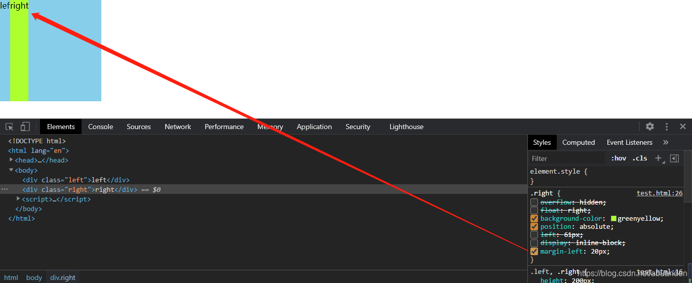
2、display:inline-block 时
- 这里加一个 margin-left 便于区分。
- inline-block 行块盒不会自动填充
- inline-block 不设置宽度时,根据内容确定宽度
3、float:right 时
- float 不设置宽度时,根据内容确定宽度
4、overflow 为其他情况时
- auto、hidden、overplay 都可以实现
- scroll 时会出现滑动条,其他都不行
# 三、利用绝对定位
<div class="wrap">
  <div class="left">left</div>
  <div class="right">right</div>
</div>
.wrap {
  position: absolute;
}
.left {
  width: 200px;
}
.right {
  position: absolute;
  top: 0;
  left: 200px;
  right: 0;
}
通过设置
right:0;来限制右边块级元素的宽度;left: 200px;来自适应宽度。
# 四、利用弹性布局
<div class="wrap">
  <div class="left">left</div>
  <div class="right">right</div>
</div>
body,
div {
  padding: 0;
  margin: 0;
}
.wrap {
  display: flex;
}
.left,
.right {
  height: 200px;
}
.left {
  width: 200px;
  background-color: skyblue;
}
.right {
  flex: 1;
  background-color: greenyellow;
}
# 一栏不定宽,一栏自适应
# 一、左侧 float:left; 右侧 overflow:hidden;(BFC)
不再赘述,原理同上面的
# 二、利用弹性布局
body,
div {
  padding: 0;
  margin: 0;
}
.wrap {
  display: flex;
}
.left,
.right {
  height: 200px;
  padding: 10px;
}
.left {
  background-color: skyblue;
}
.right {
  flex: 1;
  background-color: yellow;
}
和上面定宽一样,通过 flex:1
综上所述,使用 BFC 和 flex 布局通用性高
# 三栏布局
# 一. 浮动布局
<div
  class="left"
  > </div
  > <div
  class="right"
  > </div
  > <div
  class="center"
  > </div
  > div {
  height: 300px;
}

.left {
  float: left;
  width: 300px;
  background: red;
}

.center {
  background: yellow;
  margin: 0 300px;
}

.right {
  float: right;
  width: 300px;
  background: blue;
}
浮动布局是有局限性的,浮动元素是脱离文档流,要做清除浮动,这个处理不好的话,会带来很多问题,比如高度塌陷等。 浮动布局的优点就是比较简单,兼容性也比较好。只要清除浮动做的好,是没有什么问题的。
延伸:你知道哪些清除浮动的方案?每种方案的有什么优缺点?
# 二、绝对定位布局
.left {
  position: absolute;
  left: 0;
  width: 300px;
  background-color: red;
}
.center {
  position: absolute;
  left: 300px;
  right: 300px;
  background-color: blue;
}
.right {
  position: absolute;
  right: 0;
  width: 300px;
  background-color: #3a2cac;
}
我们需要选择给 左 中 右 都使用 absolute 绝对定位
绝对定位布局优点,很快捷,设置很方便,而且也不容易出问题,你可以很快的就能想出这种布局方式。 缺点就是,绝对定位是脱离文档流的,意味着下面的所有子元素也会脱离文档流,这就导致了这种方法的有效性和可使用性是比较差的。
# 三、flex 布局(推荐)
.main {
  display: flex;
}
.left {
  width: 400px;
  background-color: red;
}
.center {
  background-color: blue;
  word-break: break-word; /*可以不用*/
}
.right {
  background-color: red;
  width: 400px;
}
目前移动端的布局都是用 flexbox。 felxbox 的缺点就是不能兼容 IE8 及以下浏览器。
# 四、网格布局(推荐)
<div class="div">
  <div class="box1"></div>
  <div></div>
  <div></div>
</div>
.box1 {
  background: red;
}
.div {
  width: 100%;
  display: grid;
  grid-template-rows: 100px;
  grid-template-columns: 300px auto 300px;
}

# 五、圣杯布局(float+负 margin)
<div class="container">
  <div class="main col">Main</div>
  <div class="left col">Left</div>
  <div class="right col">Right</div>
</div>
/* 两边定宽,中间自适用 */
.container {
  height: 100px;
  width: 100%;
  /*父元素空出左右栏位子: 因为上一步中,左右栏定位成功了,但是中间栏的内容会被遮盖住*/
  padding: 0 200px 0 100px;
}
.col {
  height: 100px;
  float: left; /* 三个col都设置float: left,为了把left和right定位到左右部分 */
}
.main {
  background-color: aqua;
  width: 100%;
}
.left {
  width: 100px; /*这里和padding对应*/
  position: relative; /*和下面的left配合*/
  left: -100px;
  background-color: black;
  margin-left: -100%;
}
.right {
  width: 200px;
  background-color: blue;
  margin-left: -200px; /*这里和padding对应*/
}
圣杯布局使用
float布局框架 , margin为负值 , position: relative定位,不添加额外标签
# 六、双飞翼布局
<div class="container">
  <div class="main col ">
    <div class="main_inner">Main</div>
  </div>
  <div class="left col ">Left</div>
  <div class="right col ">Right</div>
</div>
body,
html,
.container {
  height: 100%;
  padding: 0;
  margin: 0;
}
.col {
  float: left; /* 把left和right定位到左右部分 */
}
.main {
  width: 100%;
  height: 100%;
  background: #659;
}
.main_inner {
  /* 处理中间栏的内容被遮盖问题 */
  margin: 0 200px 0 100px;
}
.left {
  width: 100px;
  height: 100%;
  margin-left: -100%;
  background: #ff69b4;
}
.right {
  height: 100%;
  width: 200px;
  margin-left: -200px;
  background: #ff69b4;
}
双飞翼布局的优点: (1)主要的内容先加载的优化。
(2)兼容目前所有的主流浏览器,包括 IE6 在内。
(3)实现不同的布局方式,可以通过调整相关 CSS 属性即可实现。
圣杯布局和双飞翼布局达到的效果基本相同,都是侧边两栏宽度固定,中间栏宽度自适应。 主要的不同之处就是在解决中间部分被挡住的问题时,采取的解决办法不一样.
圣杯布局是在父元素上设置了padding-left和padding-right,在给左边的内容设置position为relative,通过左移来使得左右两边的内容得以很好的展现。
而双飞翼则是在 center 这个 div 中再加了一个 div 来放置内容,在给这个新的div设置margin-left和margin-right。